CSS Box Model: Your Guide to Layout Mastery
Welcome to a world where elements on a webpage are like Russian nesting dolls, each containing a hidden structure that affects layout and spacing. Today, we’ll unravel the mystery of the CSS Box Model — a fundamental concept that forms the backbone of web design. By the end of this interactive journey, you’ll confidently wield this knowledge to create pixel-perfect layouts that shine on every screen.
Understanding the CSS Box Model:
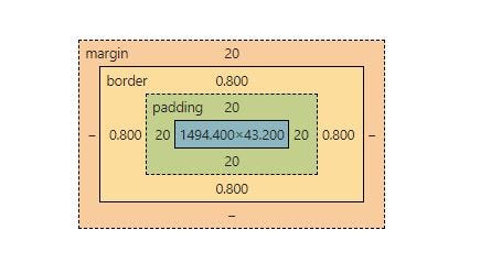
Imagine every HTML element as a box, a container that holds content, padding, borders, and margins. The CSS Box Model is your blueprint to understanding how these elements interact and how their sizes are calculated.

1. Content: At the heart of the box model is your content — text, images, or any information within the element. This is where you start building your web page’s essence.
2. Padding: Padding is the space between your content and the element’s border. It’s like a cushioning that adds breathing room and aesthetic appeal.
3. Border: The border wraps around your content and padding, defining the visual boundary of the element. It’s like the frame of a painting, giving structure and distinction.
4. Margin: Margins create space between elements. Think of them as the invisible buffer that separates one box from another. Margins help avoid that cramped feeling on your webpage.
Example:
Let’s imagine you’re creating a simple blog post card. Your content is the actual blog text, the padding gives it some breathing space, the border outlines the card, and the margin ensures it doesn’t stick to other cards.
Now, it’s your turn! In the comments, share an analogy that helps you remember the components of the CSS Box Model. Is it like layers of a cake? Or perhaps the layers of an onion? Let’s see your creative ideas!
Conclusion
Congratulations, you’ve unboxed the secret behind beautiful web layouts! With the CSS Box Model under your belt, you’re ready to build designs that are not only visually appealing but also structurally sound. Remember, each element’s content, padding, border, and margin work in harmony to shape your webpage’s aesthetics and flow.
Feel free to explore further by experimenting with different values and observing how they impact your designs. Keep sharing your analogies and insights in the comments — let’s learn and grow together in this ever-evolving realm of web design!
Stay tuned for more exciting lessons in web development. Until next time, happy coding!
